> For the complete documentation index, see [llms.txt](https://bamtech.gitbook.io/ux-ui-standards/llms.txt). Markdown versions of documentation pages are available by appending `.md` to page URLs; this page is available as [Markdown](https://bamtech.gitbook.io/ux-ui-standards/ui-standards/colors.md).
# Colors
## Why colors matter
### 1) Reflect the personality of a brand
* Color can set the basic mood of a brand or a product.
> A research made by CCICOLOR says that users only take 90 seconds to estimate products, and between 62% and 90% of the judgment of their initial view is upon the colorscheme.
* Also Color increases brand recognition by up to 80 percent because they help to store images in our brains *(University of Loyola, Maryland study)*
### 2) Achieve better user experience
* Support better readability of the information.
* Increase usability sharply, such as strengthen call-to-actions, enhance navigation, stimulate intuitive interactions, satisfy aesthetic needs and visual solutions.
### 3) Influence the purchasing decision
* Visual apperance of a product is key to purchasing decisions -> colors are part of the marketing campains
> Ads in color are read up to 42% more often than the same ads in black and white *(White, Jan V., Color for Impact, Strathmoor Press, April, 1997).*
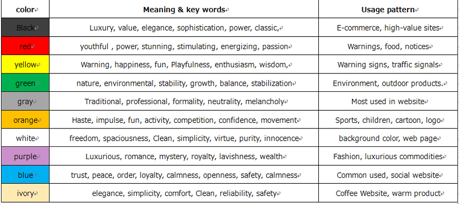
## Concepts about colors
Use it wisely means hit the **5 “rights”**:
* choose the **right color**,
* *what are the trendy colors of the moment?*
* *what is the color's meaning?*
* at the right **time**,
* *when will this color be used?*
* *what will be the state of mind of my user?*
* in a right **usage pattern**,
* *For what do we need a color?*
* *What does it express?*
* with the **right users**,
* *Who are my users?*
* *What are their favorite trendy colors?*
* and target the **right goals**.
* *What message do I want to convey with my color?*
## Right color for my users
### Color preferences
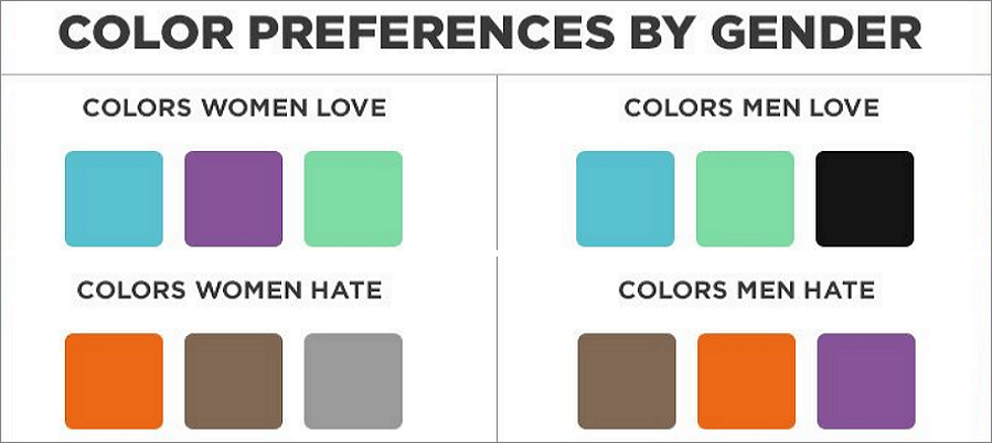
Women don’t like gray, orange, and brown. They like blue, purple, and green, while men don’t like orange, purple and brown. Men like blue, green, and black. It’s definitely a disaster if you doing a sporting design in purple. Just remember, whenever you are targeting to men, choose the color that convey maleness. Similarly, use female color to do the design that mainly used by ladies.

### Light vs. dark user interface design
Color theory in UI design matters. Thinking about lightness and darkness matters.
> “Although my reasoning told me that color was unimportant, my emotional reaction told me otherwise.” [Don Norman on affect and design](http://www.jnd.org/dn.mss/emotion_design_at.html)
As with artwork, color can change the mood of a UI because it directly impacts the user’s emotions. We associate cool colors with stillness and serenity, but also sorrow. Warm colors often spark creativity or feelings of happiness. And what about keeping things simple? Black, white and elegant. Choices, choices.
###
{% hint style="info" %}
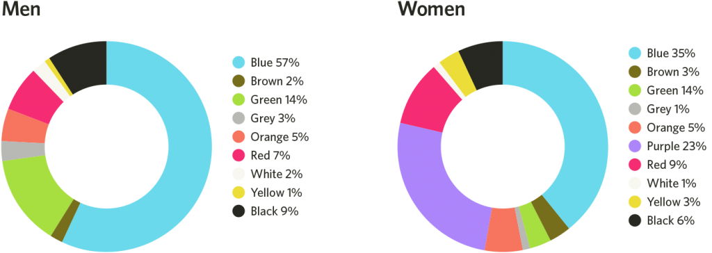
Pay attention to BLUE
According the research, blue is the NO.1 color that women and men both like. Blue is like everywhere, in nature, in sites, in clothes, etc. A lot of colors from designer’s toolbox such as red, orange, and green already have strong built-in associations —for error, caution/safety, success. This makes blue color a good choice for designers.

Blue is definitely a safe color that can cultivate user’s trust and be accepted, blue is a typical example of color in UI design. If you have no better choice, just use blue.
{% endhint %}

## Usage patterns
### Color ratio
**6:3: 1 rule**
The 60% + 30% + 10% principle is the best proportion to reach balance among colors. This criterion can work perfectly by cultivating a balance, neat, harmonious interface that brings pleasure to the users. Also, it can ease users’ eye to move comfortably from one point to the next.
{% hint style="info" %}
**Creating color variation**
Darker color variations are made by lowering brightness and increasing saturation. Brighter color variations are made by increasing brightness and lowering saturation.” [source](https://www.bram.us/2017/02/03/color-in-ui-design-a-practical-framework/).
{% endhint %}
**max 3 primary colors**
This rules match with the The Golden (6:3:1) Rule. It’s also a good way to avoid chaos and keep in balance in your color scheme.
####
### Color combinations
**Contrast**
Color contrast is also a practical method of color in UI design. Colors on opposite sides of the color wheel can generate the strongest contrast, like black and white. Strong contrast can draw users’ concentration and tension; while light contrast can bring comfort and please by displaying a relaxing and casual design.
#### Black, white and elegant
Black is the strongest of all the neutral colors, while white is the most used background color. As mentioned above, those two are the greatest level of color contrast. Adopt black with white properly, you can create a UI interface that looking elegant. This color scheme is mostly used in website. Black can give a feeling of sophistication, and white space can create a sense of freedom and imagination.

####
#### Get inspiration from nature and art
Nature and art are the main resources of color inspiration. Just go outside, look at the sky, you’ll see the most various and natural blue. Color in nature is the best choice to create a feeling of user-friendly and natural.
## Tools and templates
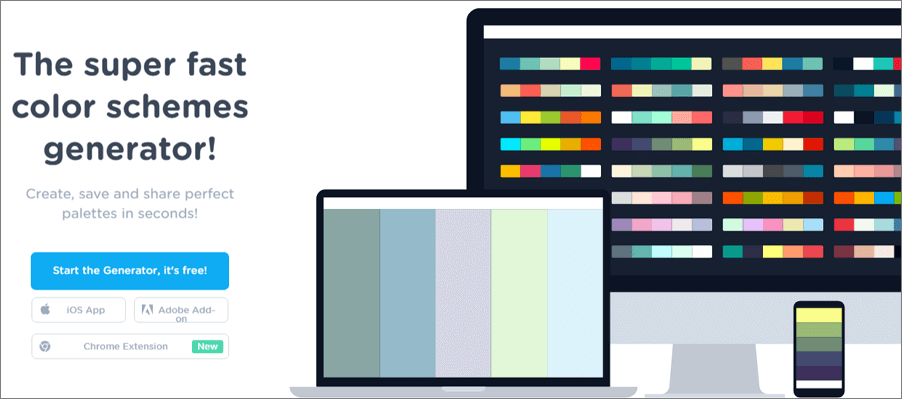
### 1) [Coolors.co](https://coolors.co/)
### 2) [Mockplus](https://www.mockplus.com/blog/post/mockplus3-2/?r=trista)
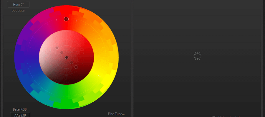
### 3) [Paletton](http://paletton.com/)
This tool is especially useful when you have picked your primary colors and want to generate extra tones.
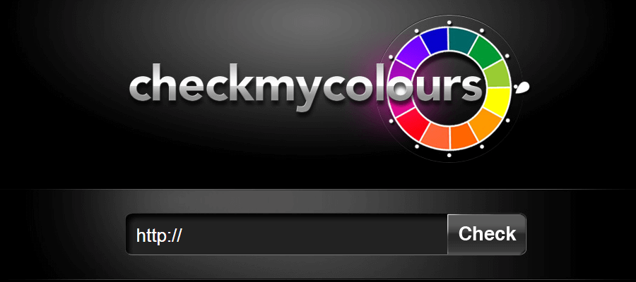
### 4) [Check my Color](http://www.checkmycolours.com/)
It is a tool for checking foreground and background color combinations of all DOM elements and determining if they provide sufficient contrast when viewed by someone having color deficits.
### What’s the best UI design? Dark or light UI? Take a look at how UI colors affect site conversion and the user experience
#### Dark or light UI?
When it comes to using color in your user interface design, some web users prefer light-themed designs because dark text on light backgrounds are less strain on the eye in terms of readability. Take this post, for example, that you’re either reading on your desktop or mobile device. If the UI were dark with light text, by the time you finished reading, you’d be pretty tired.
Black text (Hex value #000000), or charcoal gray (#333333) on a light background provides maximal value contrast, according to [Stack Exchange](https://ux.stackexchange.com/questions/52833/which-color-scheme-to-choose-for-applications-that-require-long-work-hours/52947#52947), and therefore optical readability for extended periods of reading. Hurray for WordPress’ light-themed UI then!

Having said that, there are users who opt for dark UIs. For instance, code editors and visual designers prefer dark themes because they simplify complex interfaces. The contrast level of light text on a dark background makes for minimal eye strain over an extended period of time (5 hours or more).
According to a recent survey that Justinmind performed with UI, Web and UX Designers:
* At work, 49% of web users prefer a black UI, 37% preferred a white UI, 8% opted for other colors, and 6% didn’t have a preference.
* Outside of the office, 32% of users prefer a black UI, another 32% preferred a white UI, 16% opted for other colors, another 16% didn’t have a preference, and 4% opted for a UI where they could customize the color themselves.
Choosing the right color combination can be a tough call. Keeping everyone happy isn’t easy, and there is no standard, no easy way out. Luckily, there are techniques to help guide you towards the **best UI design** for your users.
### What aspects of user interface design should affect your color choice?
With so many colors to choose from, how do you go about picking and choosing the right one? The colors you choose will affect how users engage with your UI. The best UI designs follow a set of **UI design principles** in order to select an appropriate color scheme. These principles include:
* **Clarity** – the user should be able to clearly see all the UI elements. Color contrast helps to distinguish between elements and highlight important components. Contrasting both hue and value between the background and UI elements such as Call to Action buttons can strengthen legibility and navigation.
As [Tubikstudio](https://tubikstudio.com/light-and-darkness-in-ui-design-matter-of-choice/) has it: “One of the ways to check it \[check for clarity] is widely used “blur effect” when you look at the screen or page in the blurred mode and check if everything vital is easily and quickly observed.”
* **Flexibility** – design a UI that looks good in all situations and all environments. Classic light-on-dark or dark-on-light UIs will never go out of style.
* **Familiarity** – your UI elements should be recognizable to make your brand memorable. The use of color should be familiar and consistent so pick hues that users relate to (by testing them out) and when in doubt, refer to the [Golden (6:3:1) rule](https://uxdesign.cc/how-to-use-color-in-ui-design-wisely-to-create-a-perfect-ui-interface-2af42f901f4).
* **Accessibility** – in order to reach as many people as possible, background and element color should serve the **users’** needs – including those who have trouble with certain shades.
[Stack Exchange’s](https://ux.stackexchange.com/questions/52833/which-color-scheme-to-choose-for-applications-that-require-long-work-hours/52947#52947) advice on the best background to place behind text is to “use solid, contrasting colors, and avoid the use of textures and patterns, which can make letterforms difficult to distinguish or even illegible”.
* **Responsiveness** – UI colors should enhance intuitive interaction with the user on any device. When testing your UI design, test it on both desktop and mobile devices to reveal problems with the visual design.

### The user-centered approach to choosing your UI colors
According to the responses in our survey, these are the most important aspects of a UI:
* Intuitive design: 48%
* Clarity: 24%
* Consistency: 16%
* Aesthetically pleasing design: 8%
* Responsive design: 4%

Intuitive user interface design is a must. Good UI designers seek to understand human behavior and devise solutions to make their lives easier and better. But no matter what you’re looking to achieve in UI design, the most important thing is to do it for the user.
So to **UI colors**. The best way to advocate for your users is to user test. You need to know what their goals are in order to motivate them to use your product. Start by performing user research, analyze your target audience, and research the competition. This data will determine what kinds of content drives your product so that you can design accordingly.
#### Prototyping your best UI design yet
The next step is to get designing your user interface. Start by creating a low-fidelity wireframe or sketch out some ideas. These only need to define the more basic layout, navigation and components of your UI. With a basic mockup completed, the next step is to add some color.
With the data from your user research, you’ll know what your users expect in terms of light and dark themes, color schemes and other color aspects. Create a mid-to-high fidelity prototype to visualize your content.
Then, perform another round of testing and iterate off of your findings. Test out your UI color assumptions with real users to observe what they need and want from your UI.
Tip: with [Justinmind prototyping tool](https://www.justinmind.com/support/parallax-scrolling-speeds/), use SVG vectors in your prototype for full control over color!
###
---
# Agent Instructions
This documentation is published with GitBook. GitBook is the documentation platform designed so that both humans and AI agents can read, navigate, and reason over technical content effectively. Learn more at gitbook.com.
## Querying This Documentation
If you need additional information that is not directly available in this page, you can query the documentation dynamically by asking a question.
Perform an HTTP GET request on the current page URL with the `ask` query parameter:
```
GET https://bamtech.gitbook.io/ux-ui-standards/ui-standards/colors.md?ask=
```
The question should be specific, self-contained, and written in natural language.
The response will contain a direct answer to the question and relevant excerpts and sources from the documentation.
Use this mechanism when the answer is not explicitly present in the current page, you need clarification or additional context, or you want to retrieve related documentation sections.